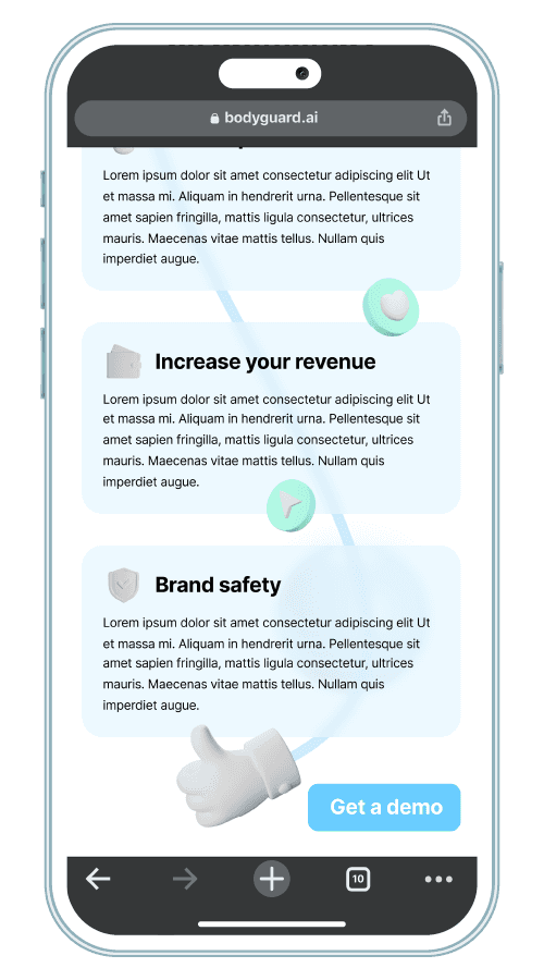
UI.UX Design
An app that feels like your happy place
Client
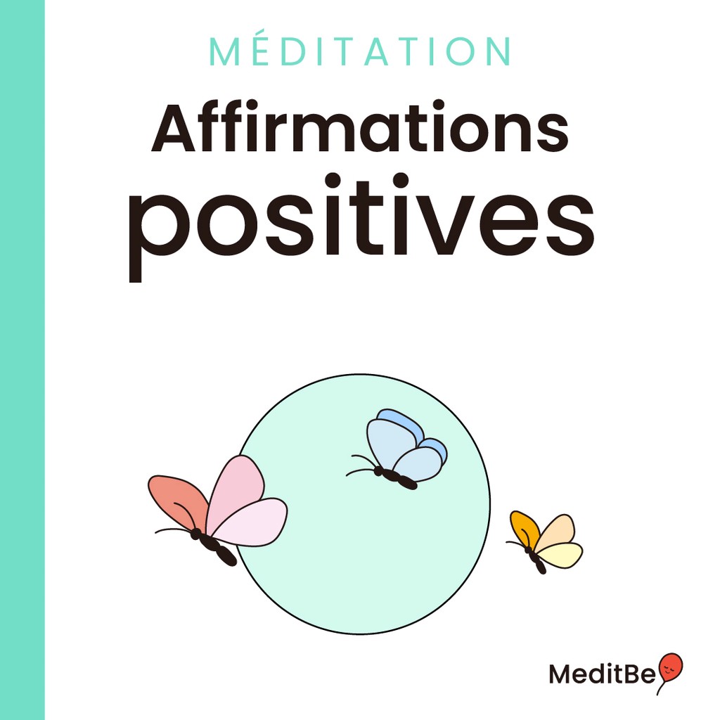
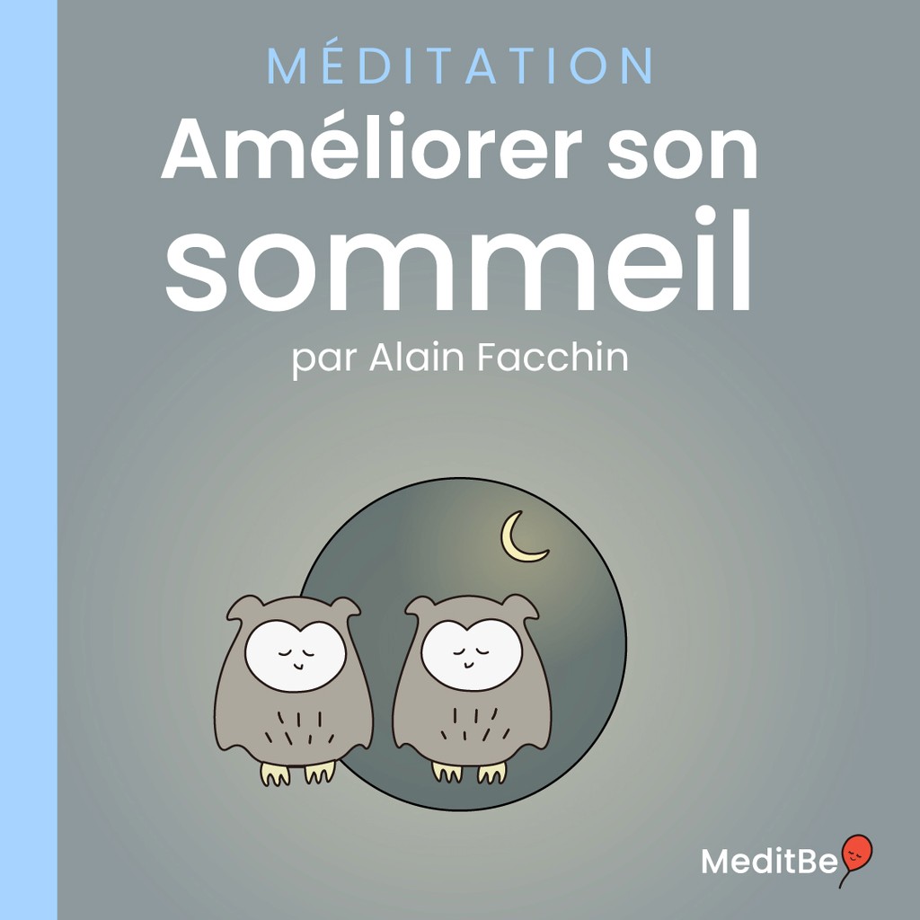
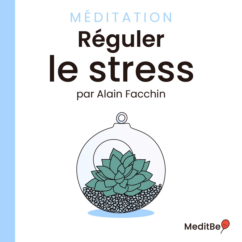
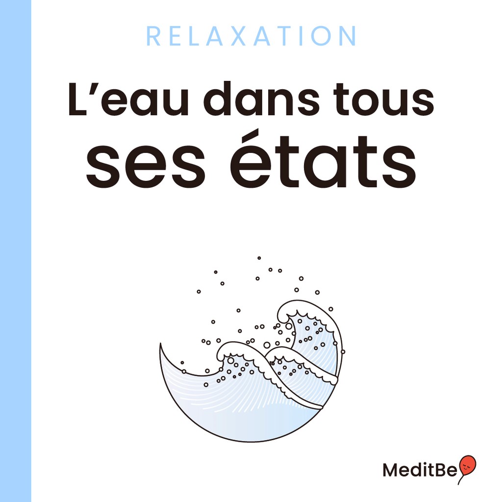
meditbe
Industry
health & wellness
Timeline
May 2023 - feb 2024
Project
mobile app
Software
Figma
My Role
Ui.UX Designer
Getting Started
A mindfulness app
Before we start, to comply with my non-disclosure agreement, I have omitted confidential information in this case study. All information is my own and does not necessarily reflect the views of the company.
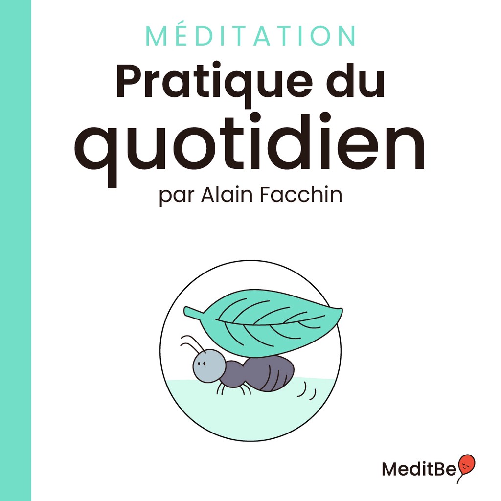
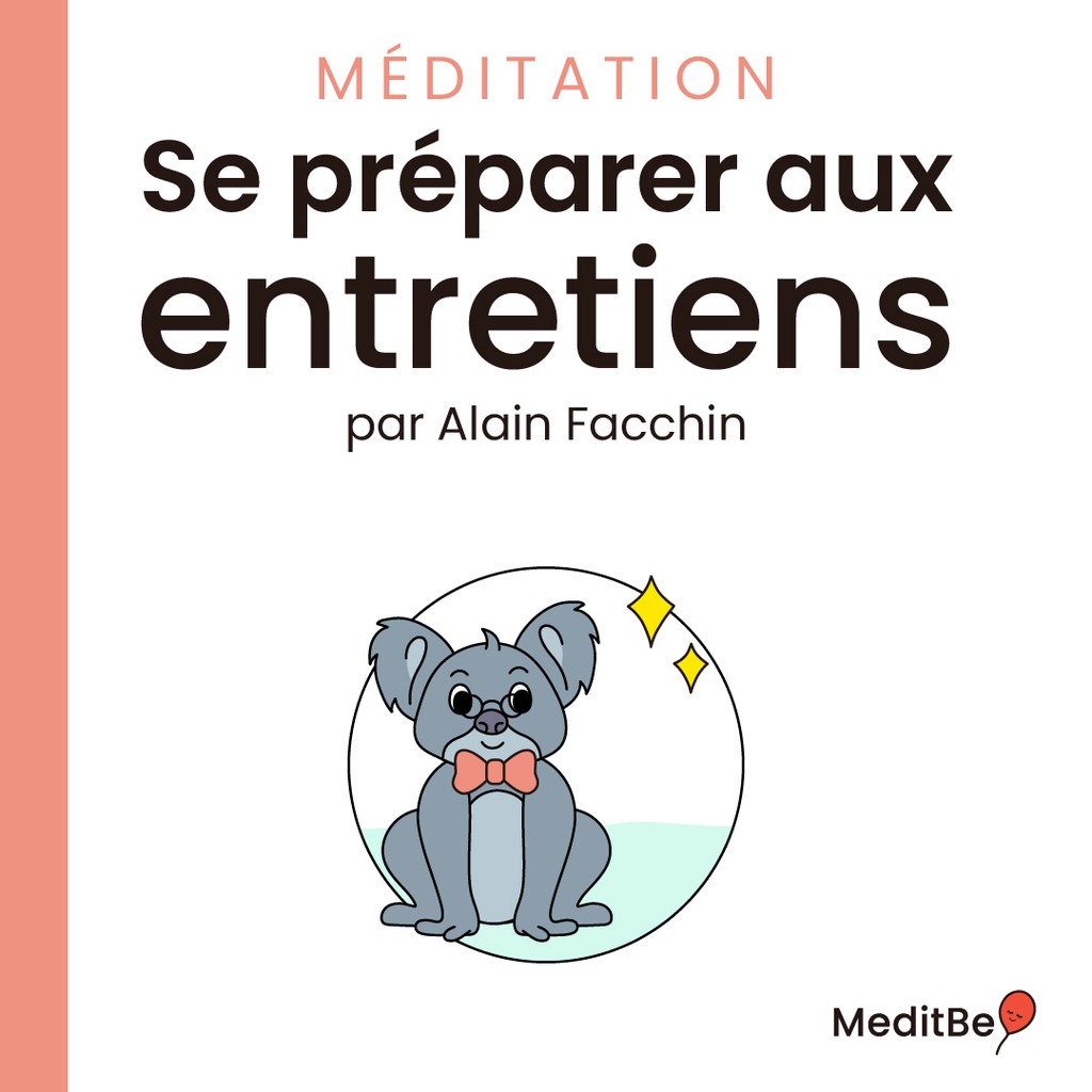
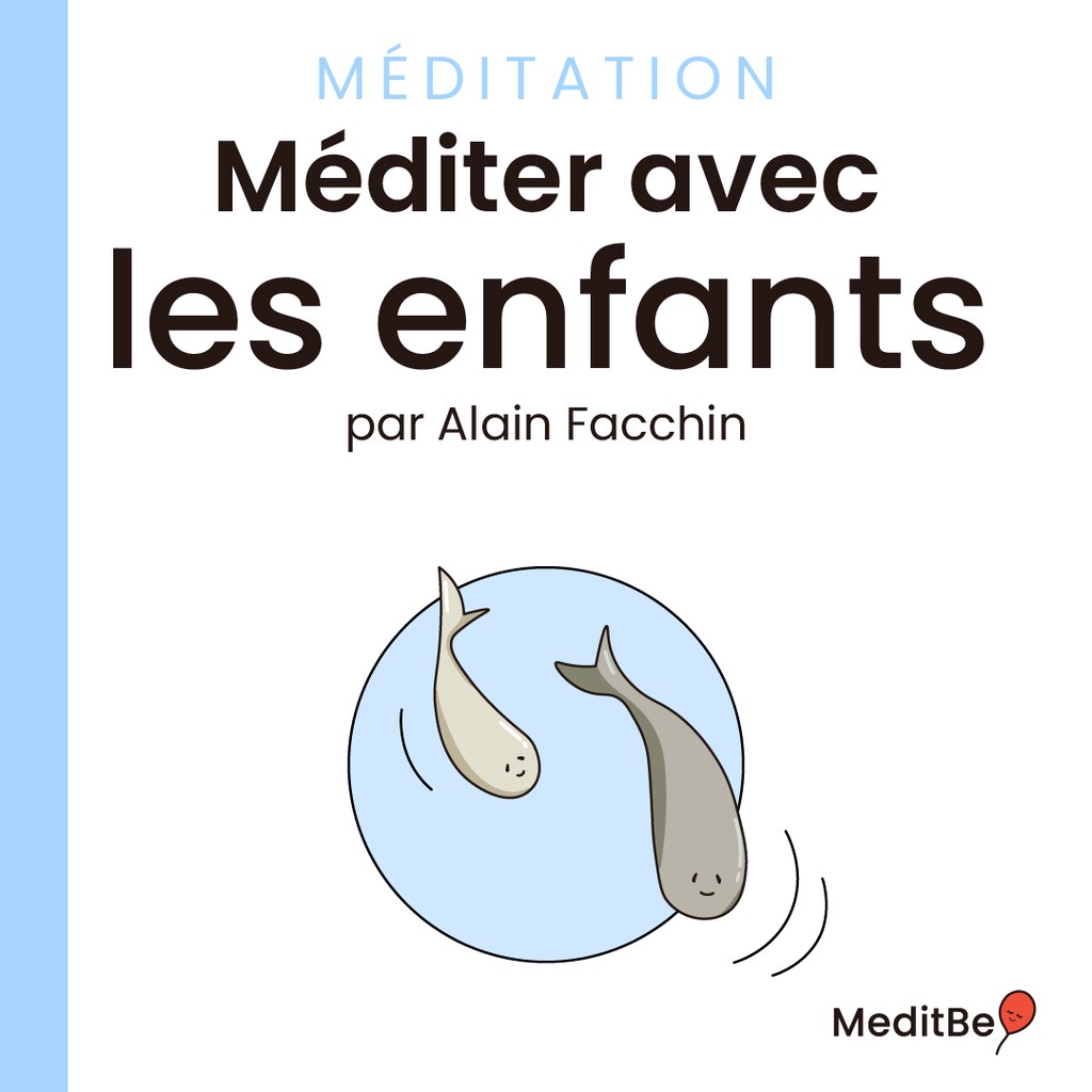
The company was created in 2021 by a business developer with the help of the well-known French mindfulness expert Alain Facchin.
MeditBe is a subscription-based French meditation app. It is available via a mobile app and a web app for desktop users. In addition to making meditation accessible to everyone, through its easy to follow programs, the goal of the company is to expand its user-base globally.
Context
The story behind the app
After years of very busy careers and never ending social duties, covid-19 hit, and everyone got some extra free time on their hands. This is how two old friends reconnected and decided to join forces to create a 100 % french mindfulness program. The goal was to introduce meditation into people's everyday life through short meditation sessions, followed by longer and more detailed programs.
At first, the sessions were streamed on different platforms. But due to their popularity among users, the duo decided to create an app, providing a larger selection of sessions and featuring different everyday life subjects.
The Challenge
The essential at a glance
With the current social media trends, users are often overwhelmed by content. We want to avoid the endless scrolling without closing down the path for discovery.
That’s why, when we talked about redesigning the app, the challenge was not only aesthetics, but it was also taking the user experience to a whole new level. The app is not only intended to be a guide, it is a mentor that shapes the learning curve according to each student.
You can spot our two-high level goals below.
1.
Empowering users to make decisions
Lead the user into choosing a path that is suitable for them, by providing information without forcing a linear path on all users.
2.
Creating a calming experience
Provide a beautiful, simple and actionable overview for users to be able to navigate throughout the app smoothly.
The Competitors
Market research
We tend to underestimate the importance of reducing the learning curve when users experience products for the first time.
However, creating a familiar experience can make the user feel more at ease when using a product for the first time. By using standard gestures and structuring content in a clear way for the users to navigate through, we give them a sense of safety and control.
And the best way to give the users this impression is by having a look at big players and mobile app guidelines to understand the tools already used out there.
We benchmarked big competitors such as Calm, Headspace, and Mind along side more local meditation apps such as Petit Bamboo and Namatata and similar products to get how they layer out information and structure their interface.
Insight #1
The user's main purpose is to find the meditation session that fits their need at the moment.
We evaluated how other competitors listed content to guide the user's choice. The main elements used to create an efficient listing where :
Color coding
Adding icons
Sorting by theme
Highlighting specific/trending content
Insight #2
The study also shed the light on important features that were common among competitors :
Downloads
Favorites
Continue Playing
These features are essential for user retention : by giving the user the opportunity to pick up where they left off, or to set aside content, they get to manage their meditation journey as they see fit.
Target Audience
Designing for our users
After gathering insights from customer support, studying competitors’ patterns, and a couple of brainstormings, we needed to get the users' perspective to make sure we reached our goals.
To do so, we selected various profiles that match our audience and pre-launched our app for them to test different scenarios. Afterwards, each user filled out a questionnaire detailing their experience providing us with important insights from a user's perspective.
The users' feedback was key to finalizing our app before the official launch.
The Brand
MeditBe : discover mindfulness
Mindfulness is being present in the moment, without judgment, by simply observing what is happening without trying to modify it. It involves consciously focusing our attention on our thoughts, our body, our emotions and our environment.
MeditBe's main purpose is to give its users the right tools to discover mindfulness and attain the peaceful state this practice provides. In order to do so, the user journey was refined to create a smooth entry, so the user can easily find what they need and embark in their mindfulness journey.
The Solution
Uplifting
Based on the insights gathered in the competitor analysis, customer support requests and former research, three core opportunities emerged.
1.
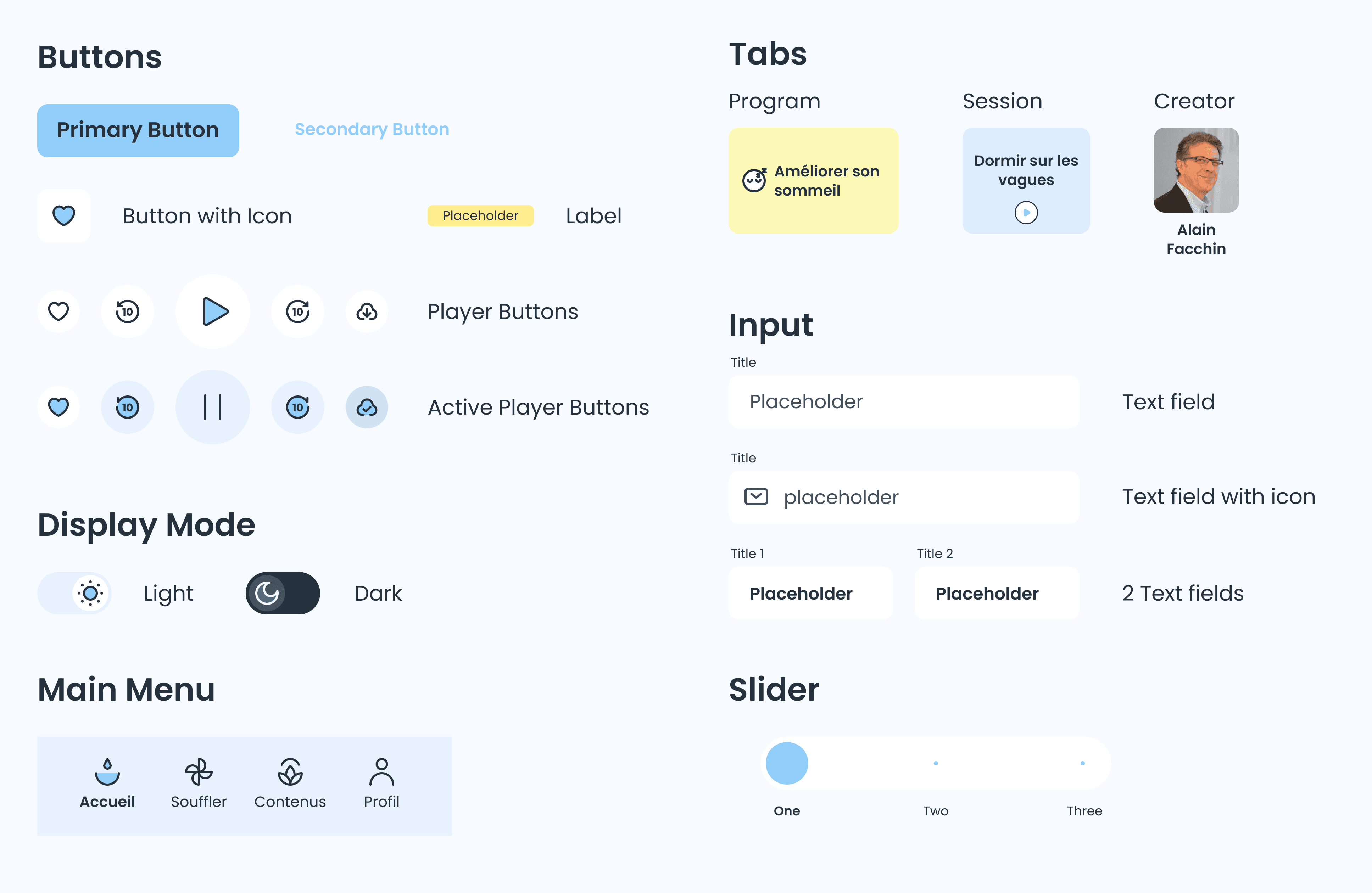
Create a unique design system
Improve the user’s experience by creating a familiarity across all the brand’s applications and maintain a consistency across different features.
2.
Customise the user's journey
3.
Improve listing & readability
Colors
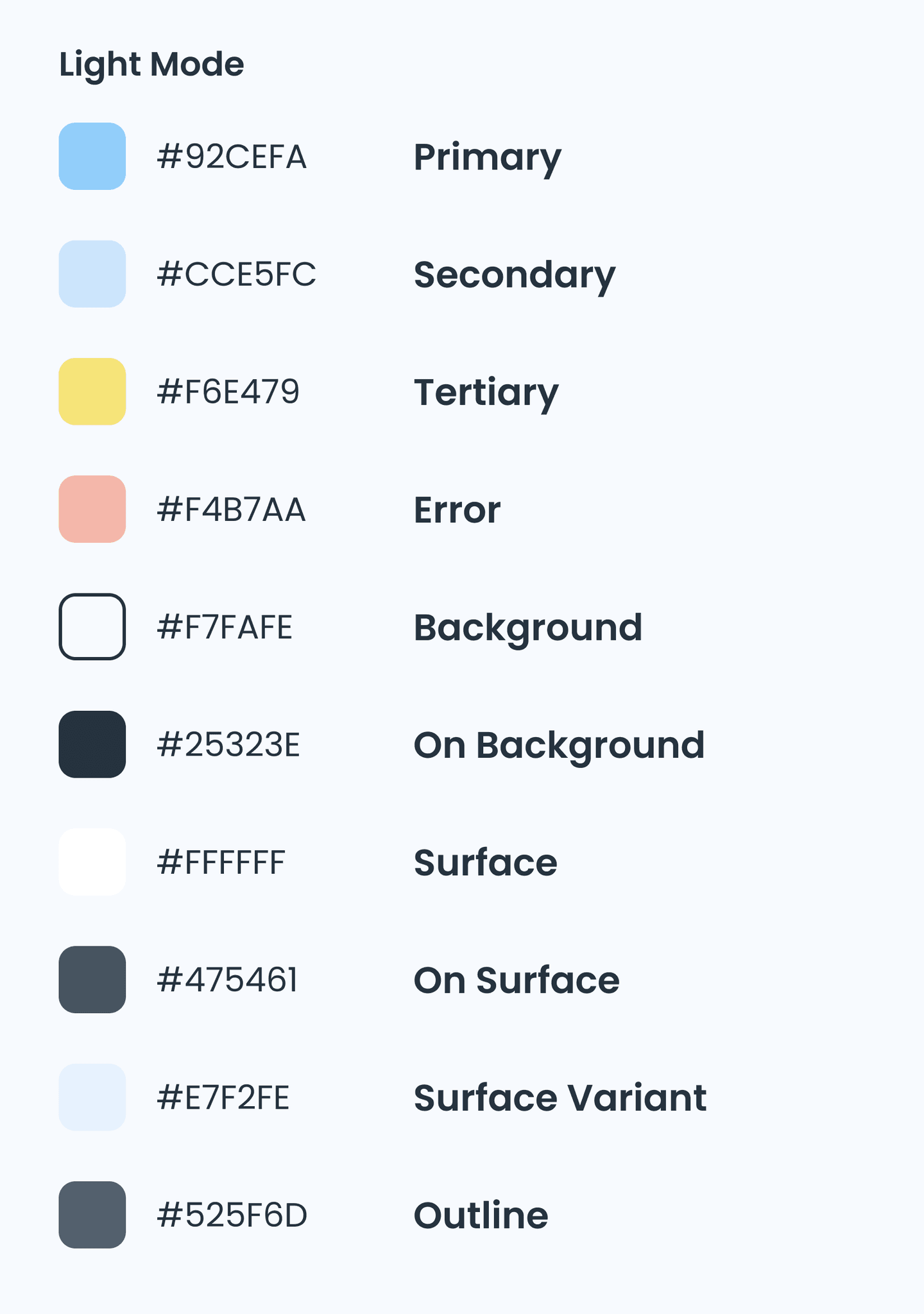
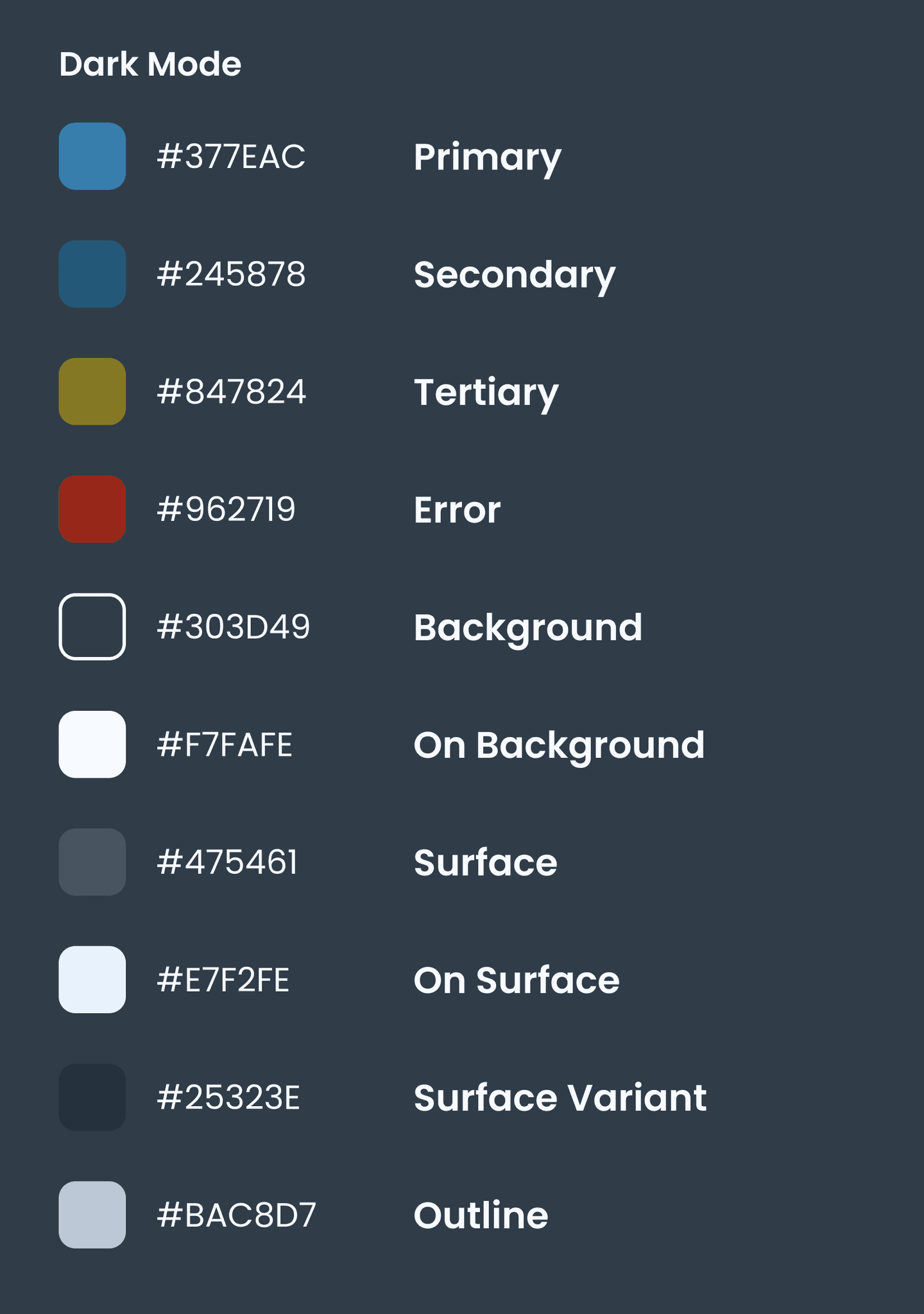
Typography
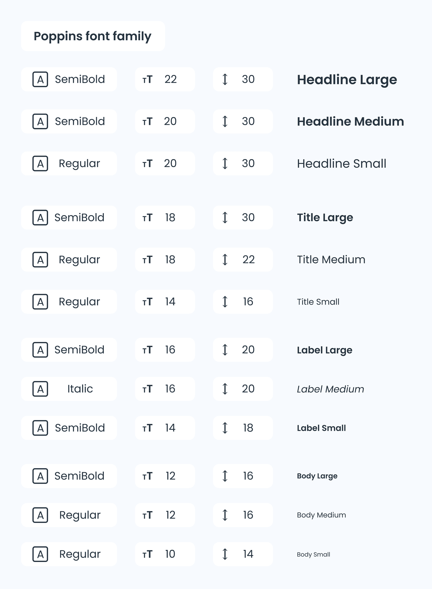
Components
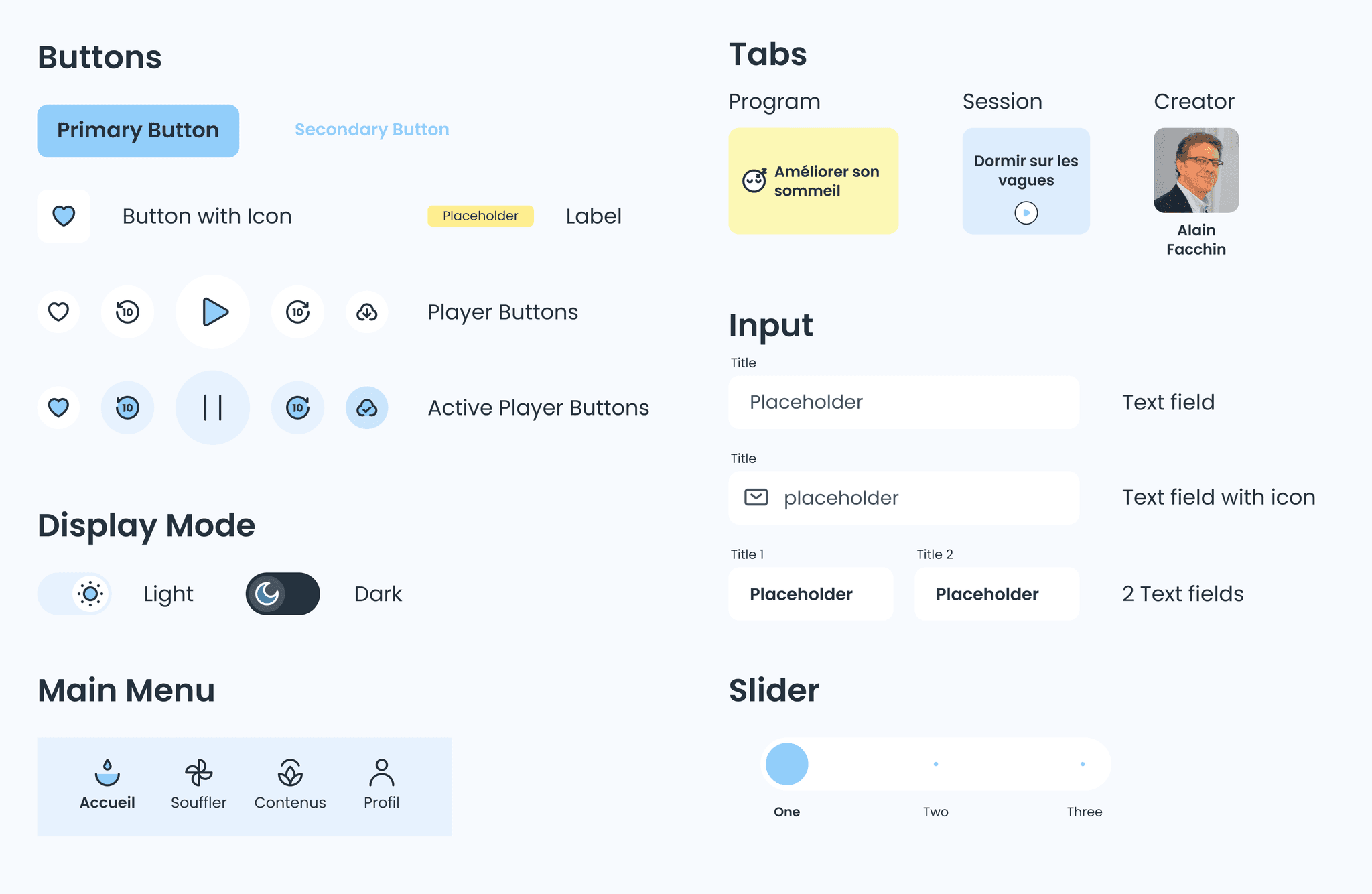
Icons
2.
Customise the user's experience & journey
Create an onboarding experience to suggest sessions according to the user's goals in addition to downloads and favorites sections.
1.
Create a unique design system
3.
Improve listing & readability
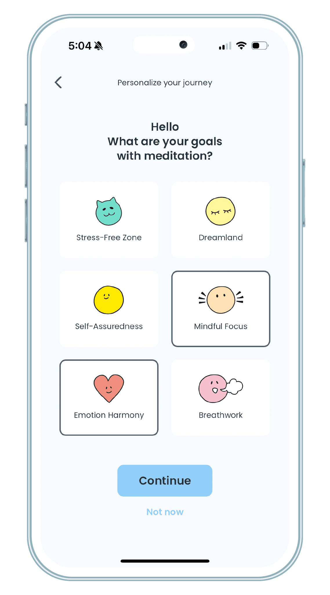
Setting goals
When onboarding, the user has the option to define their meditation goal so the app can suggest content that fits their need.
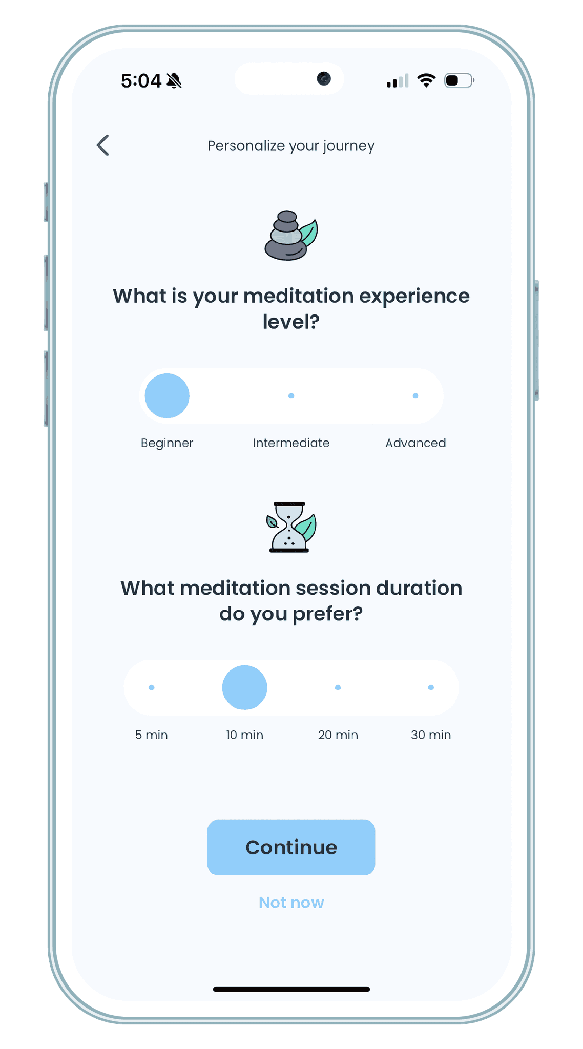
Defining expertise
In addition to goal setting, the user also sets his level of expertise and preferred timeframe to meditate. The user can redefine these settings anytime while using the app in their profile section.
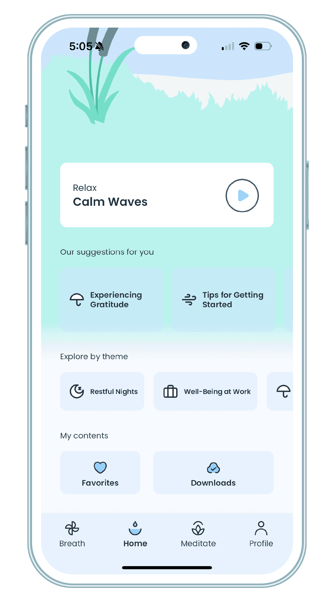
Suggestions and content
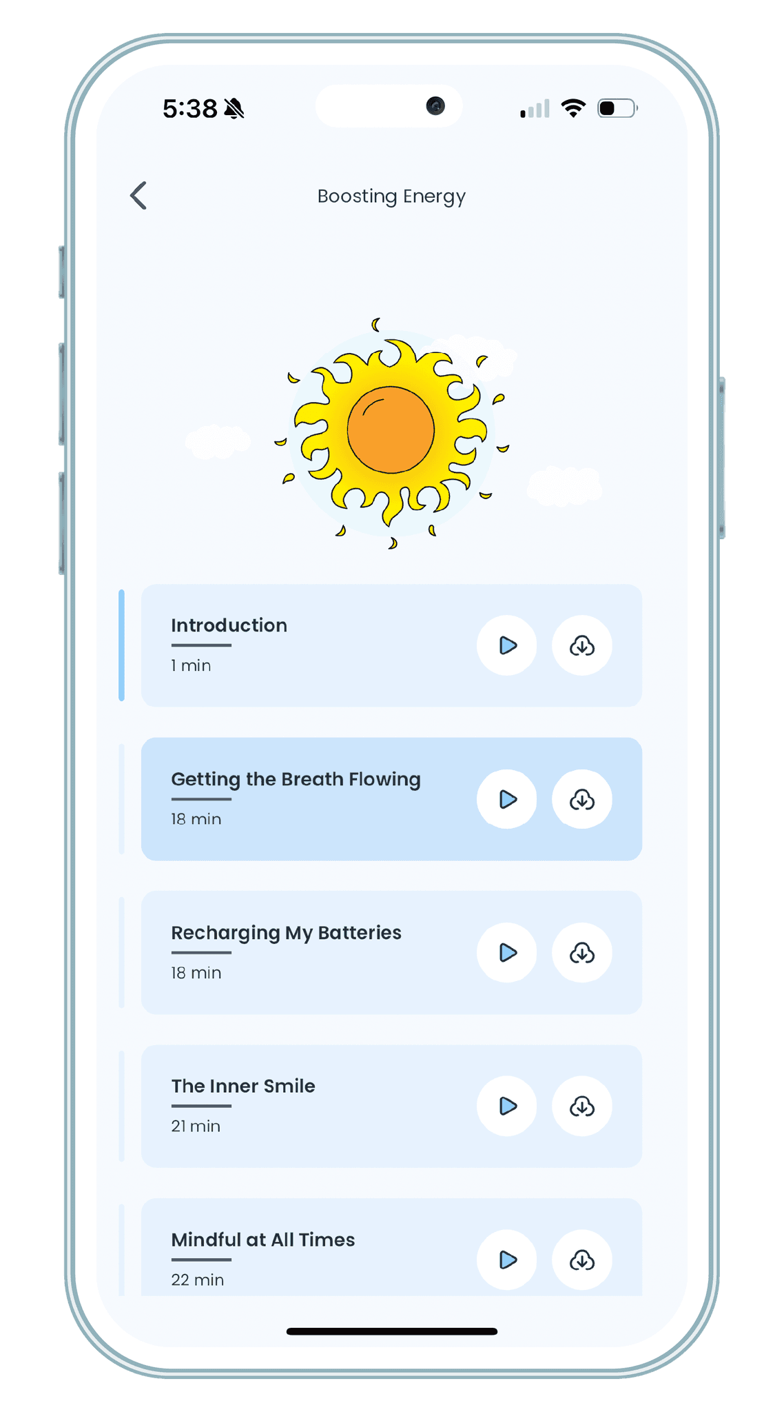
A suggestion module is available to make the choice easier for the user. They can also add content to favorites, or even download sessions to meditate offline.
3.
Improve content listing & readability
Filter content by using colors and icons, so the user can track down what they need faster.
1.
Create a unique design system
2.
Customise the user's journey
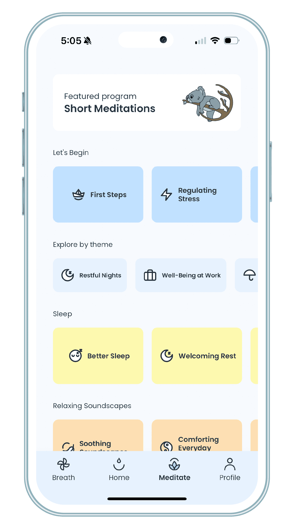
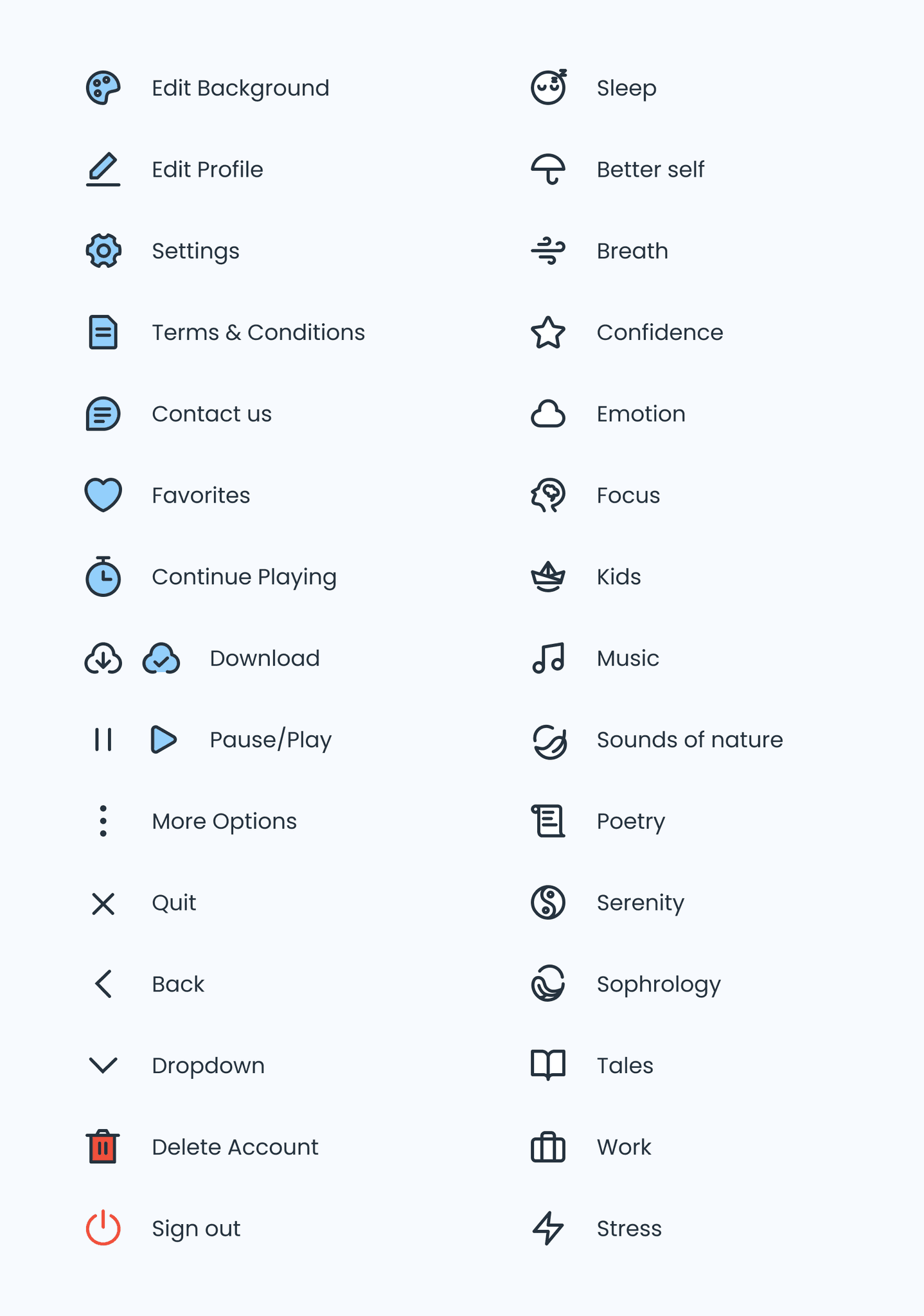
Themes and Icons
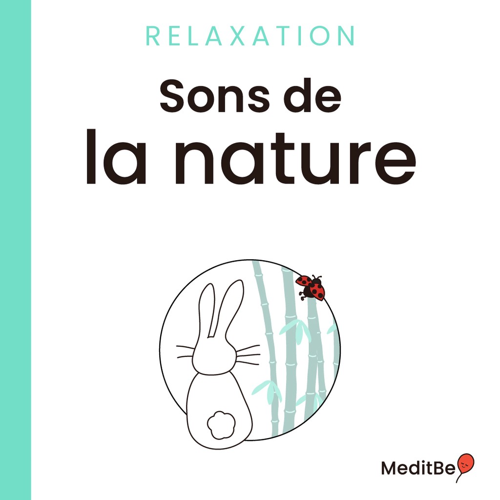
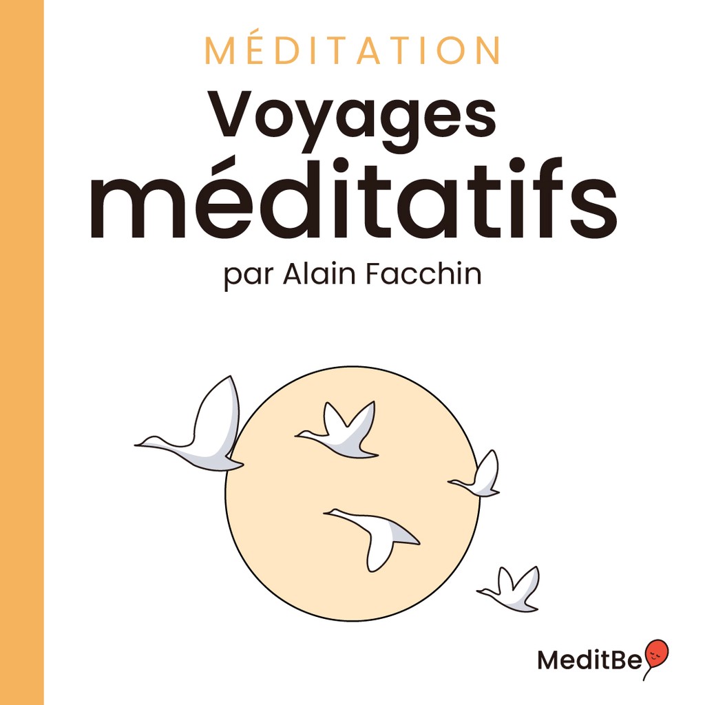
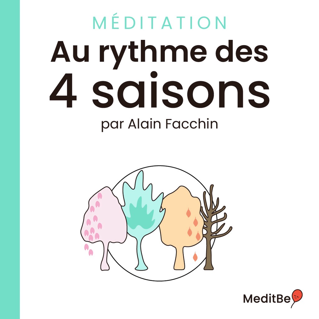
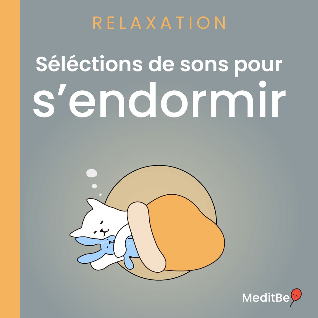
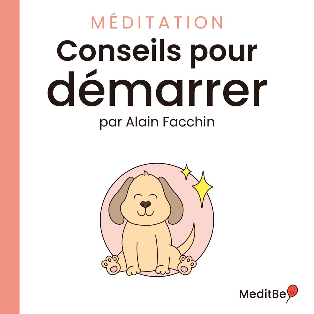
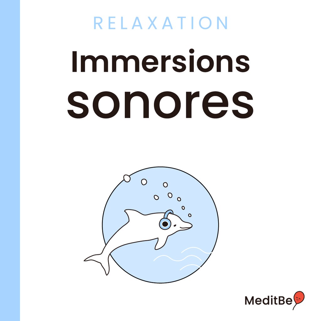
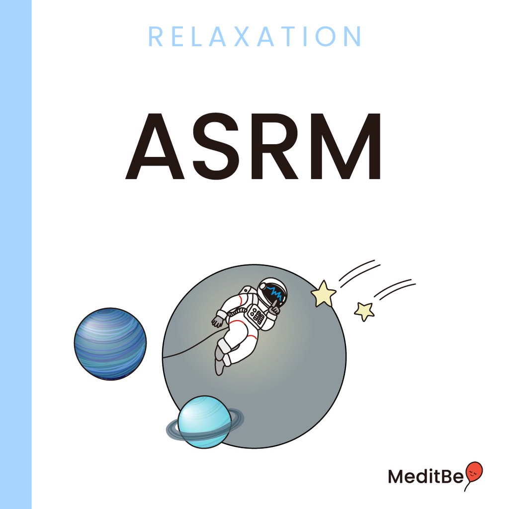
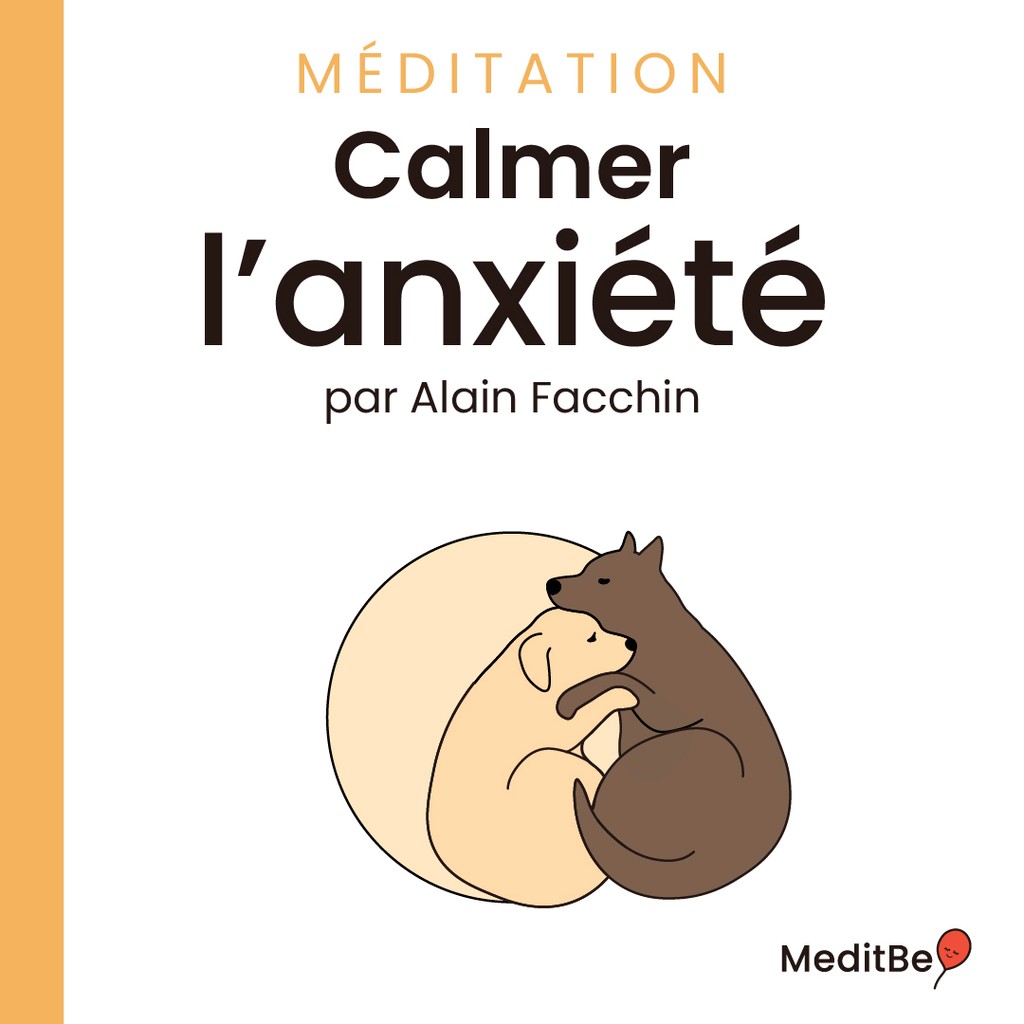
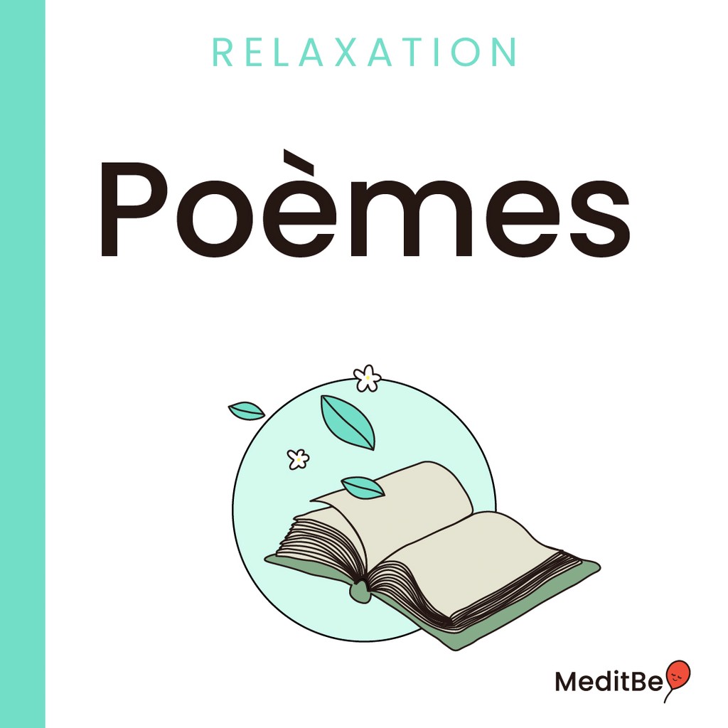
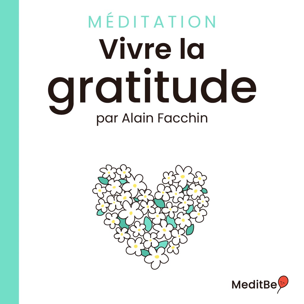
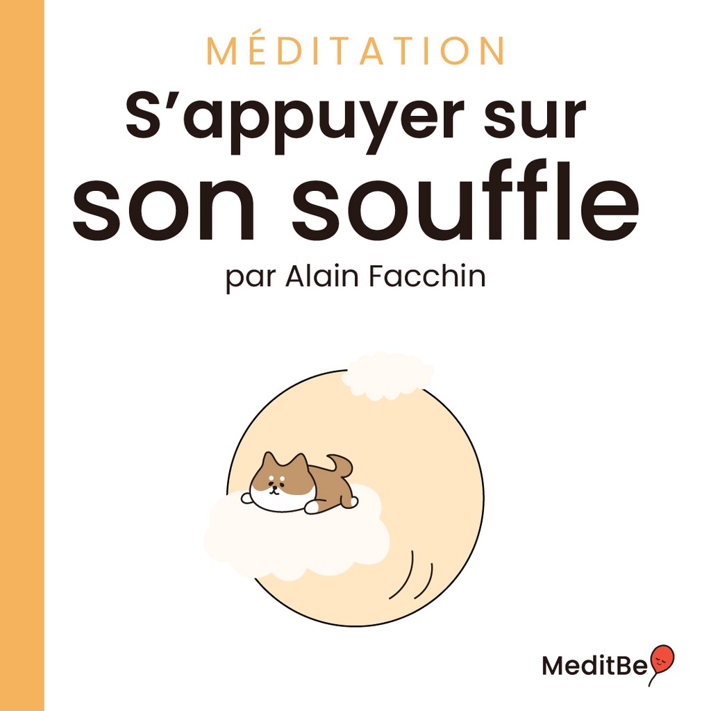
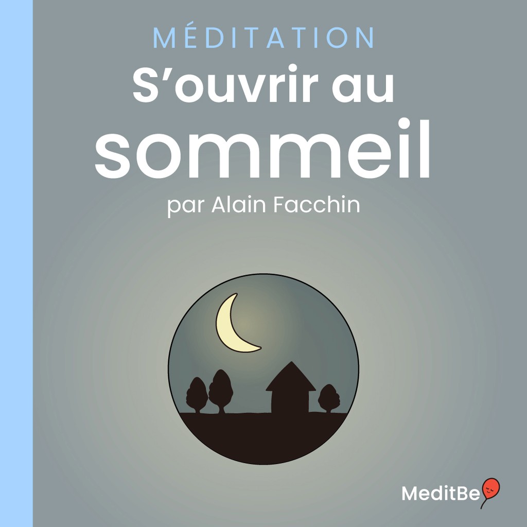
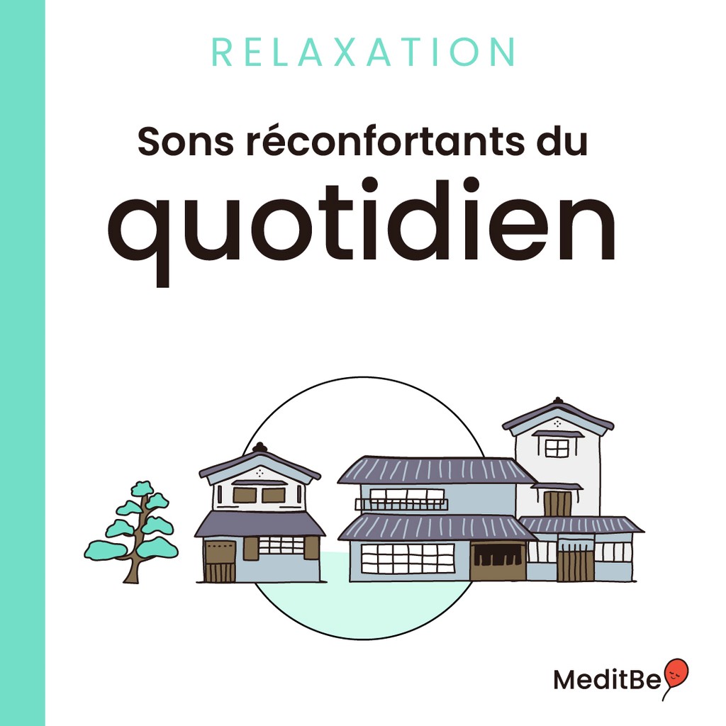
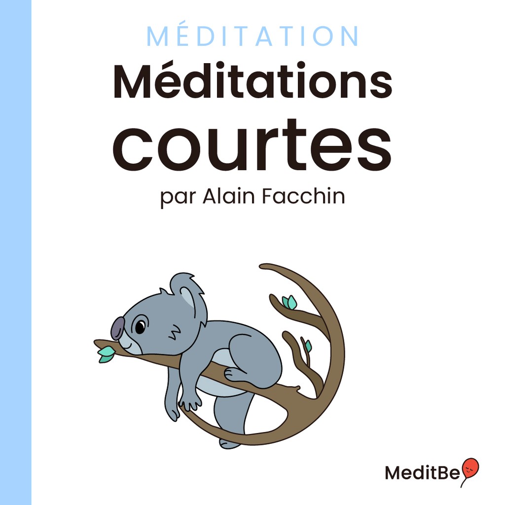
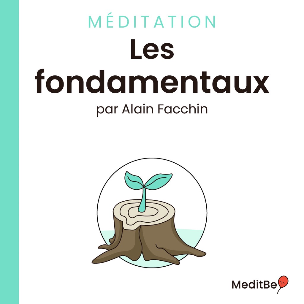
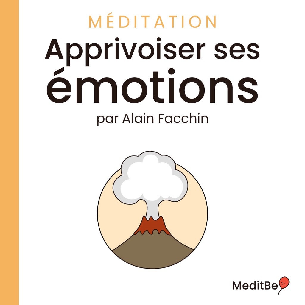
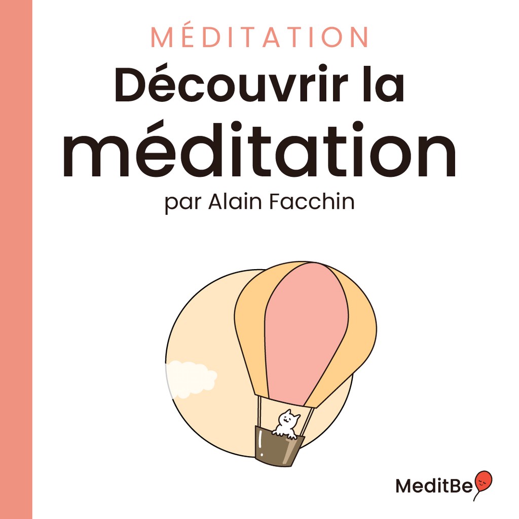
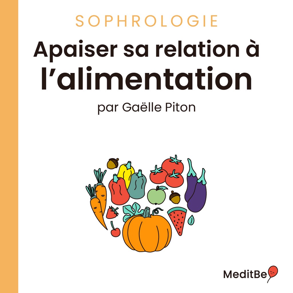
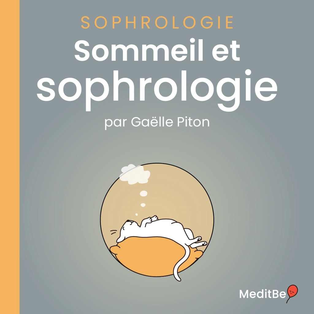
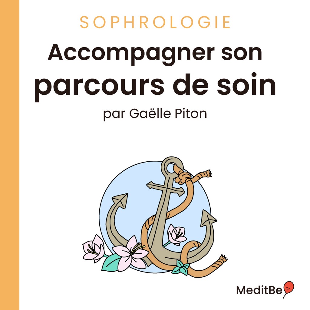
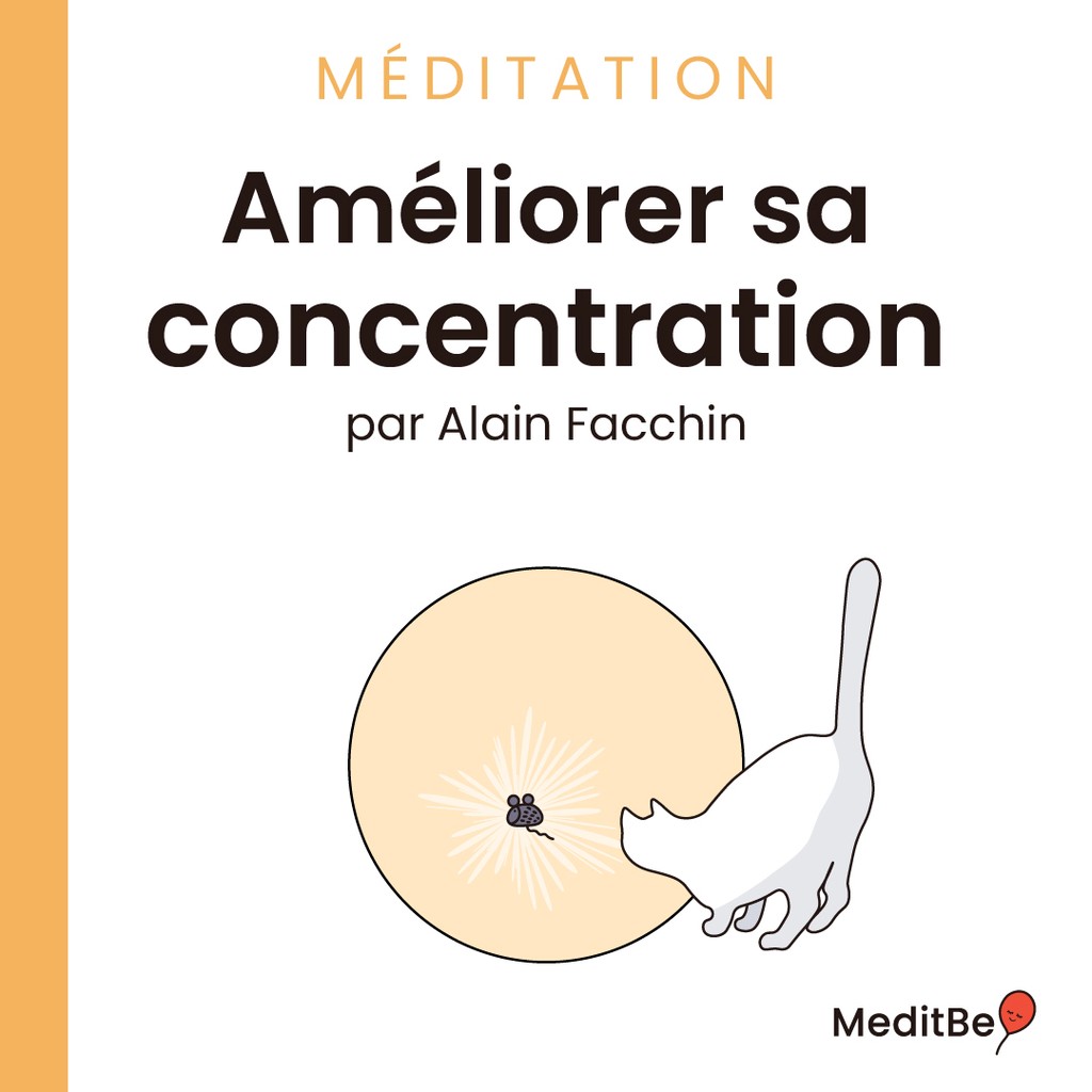
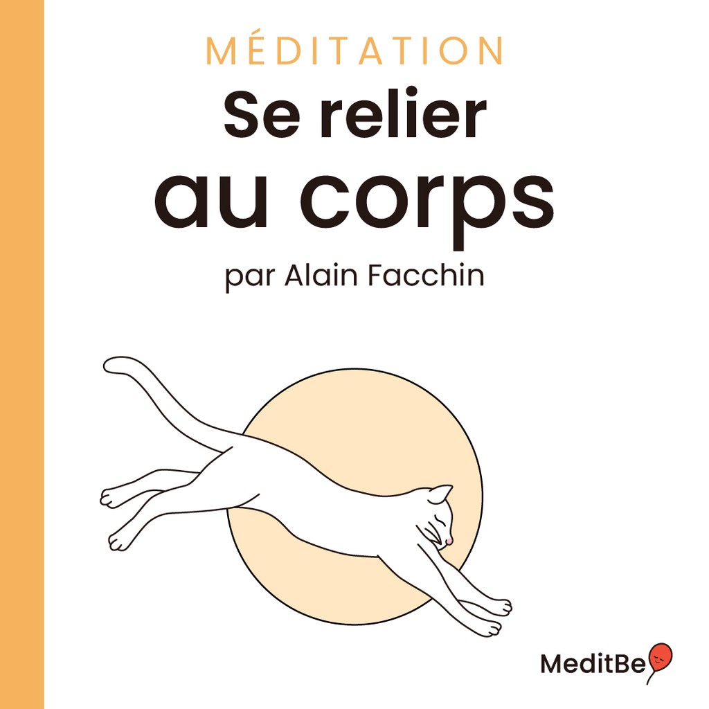
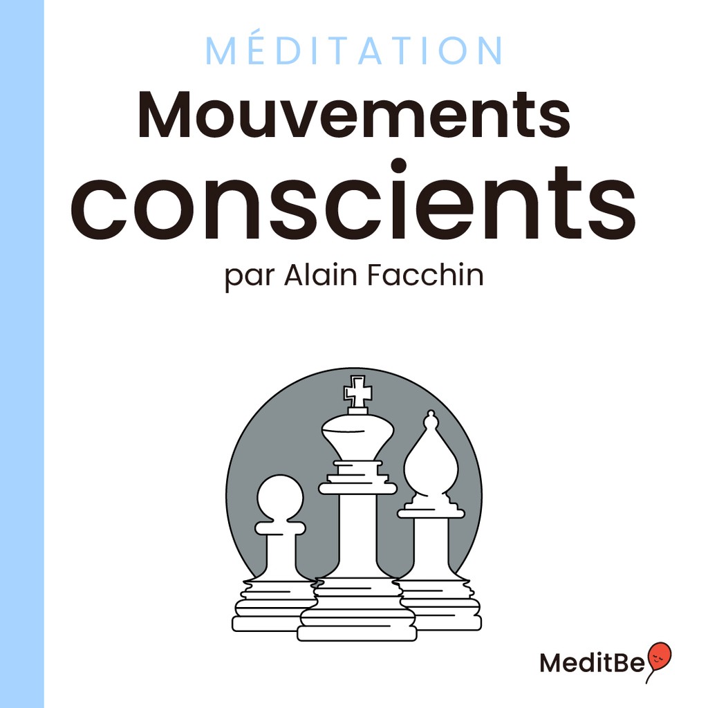
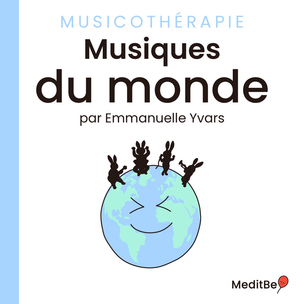
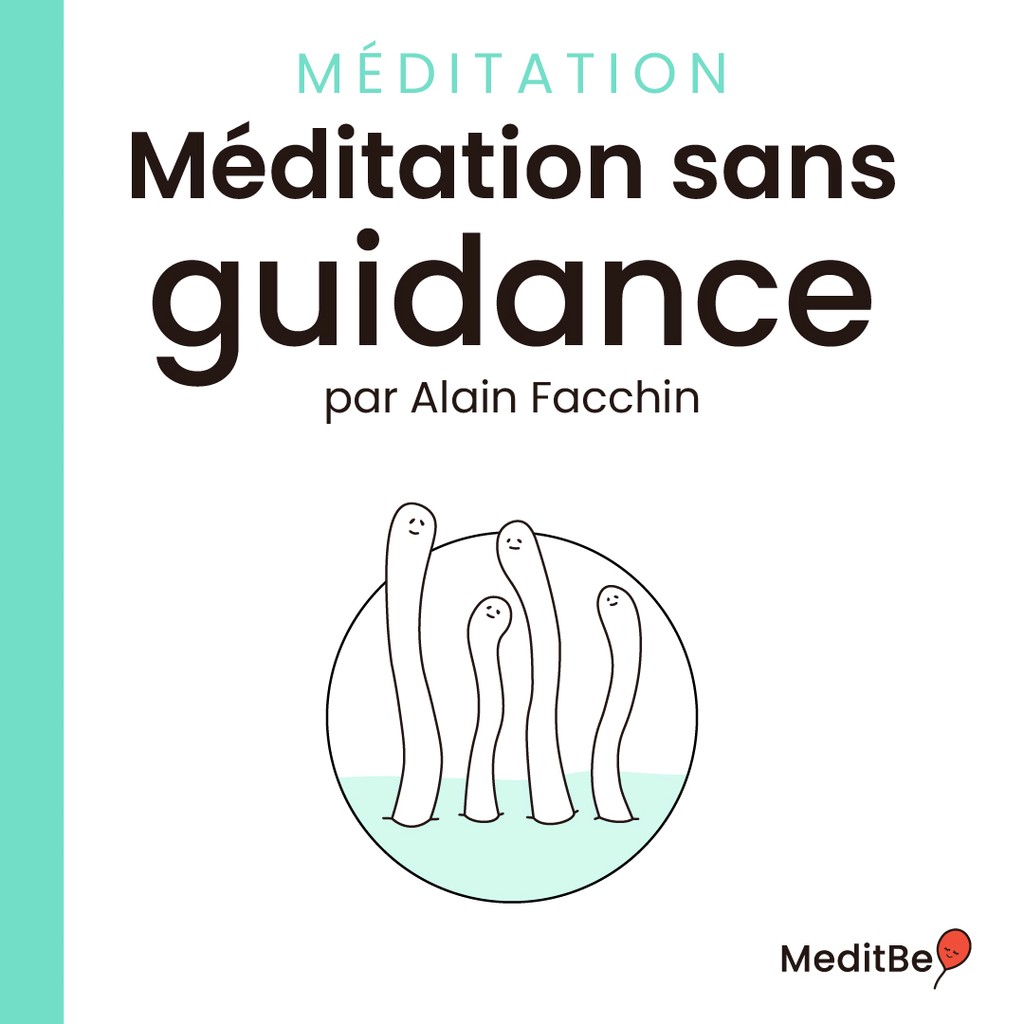
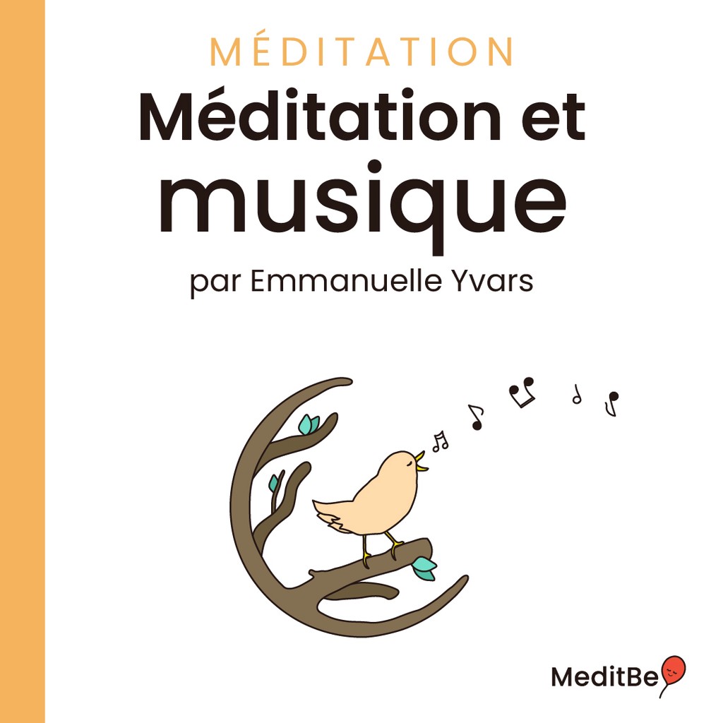
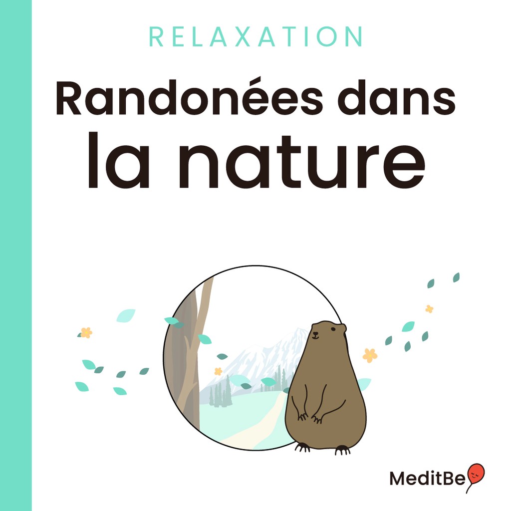
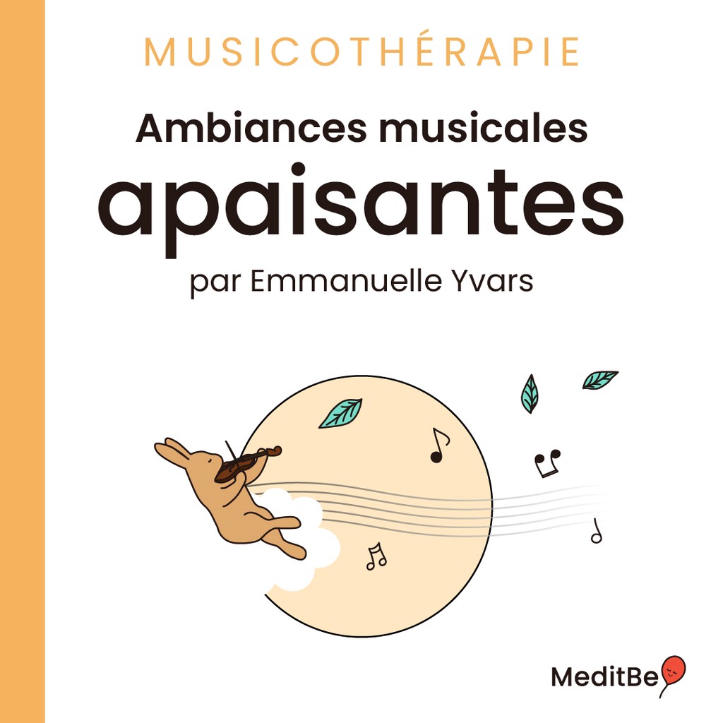
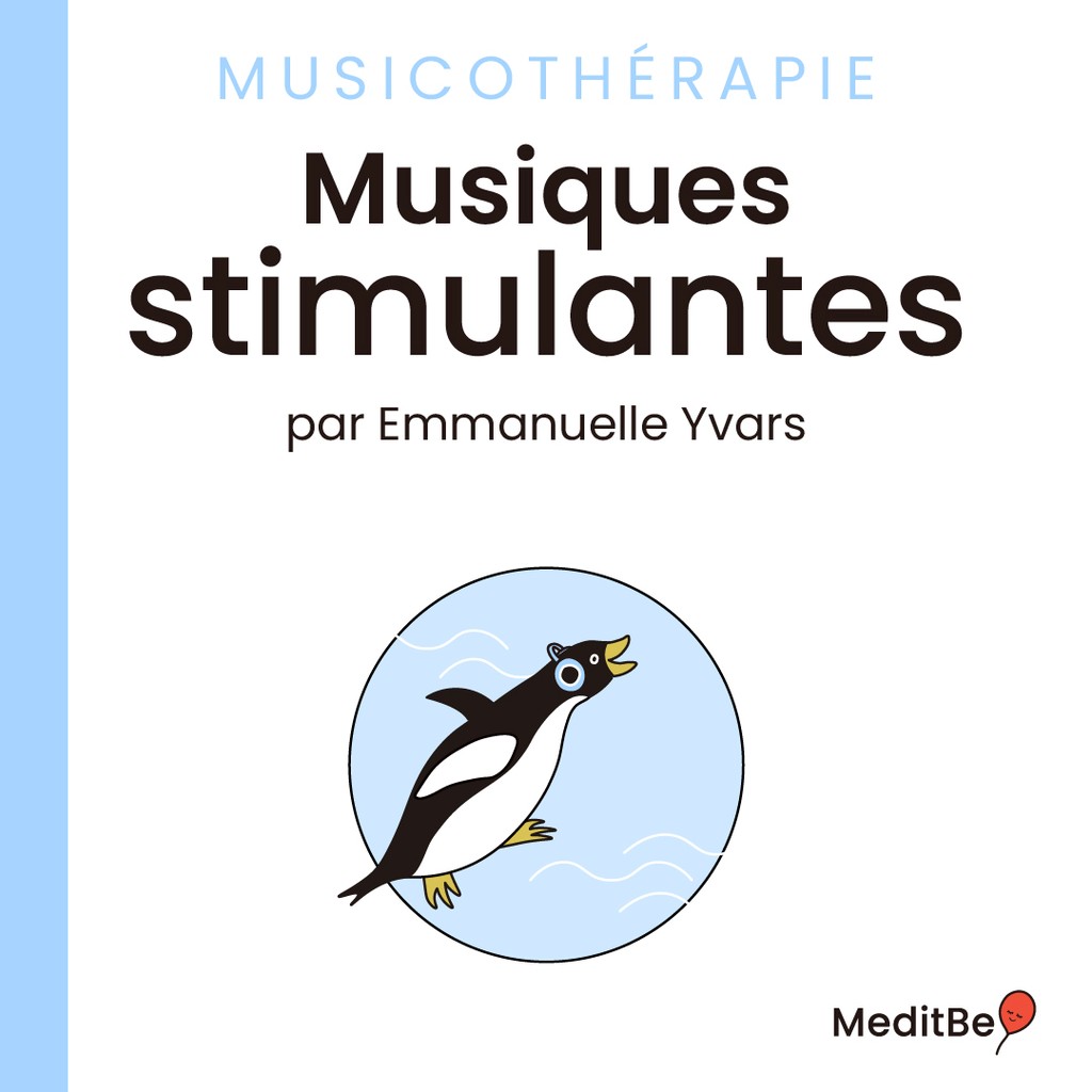
Throughout the app, the users will come across a set of icons, each reflects a subject or theme. In addition to the explore section, where meditation sessions are sorted by theme for easier access.
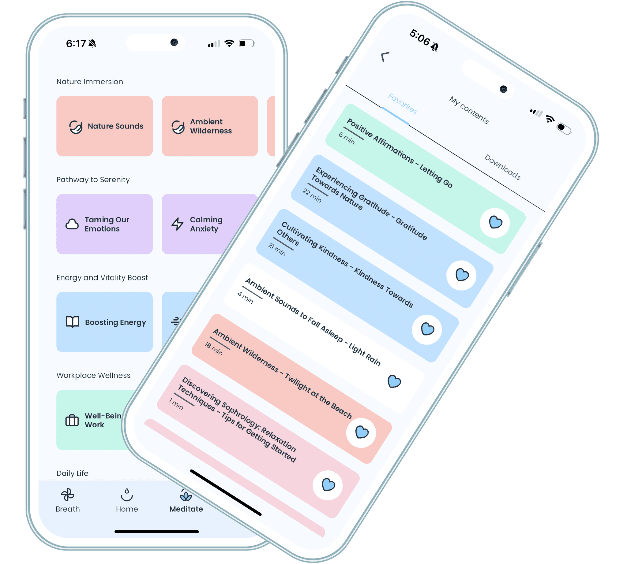
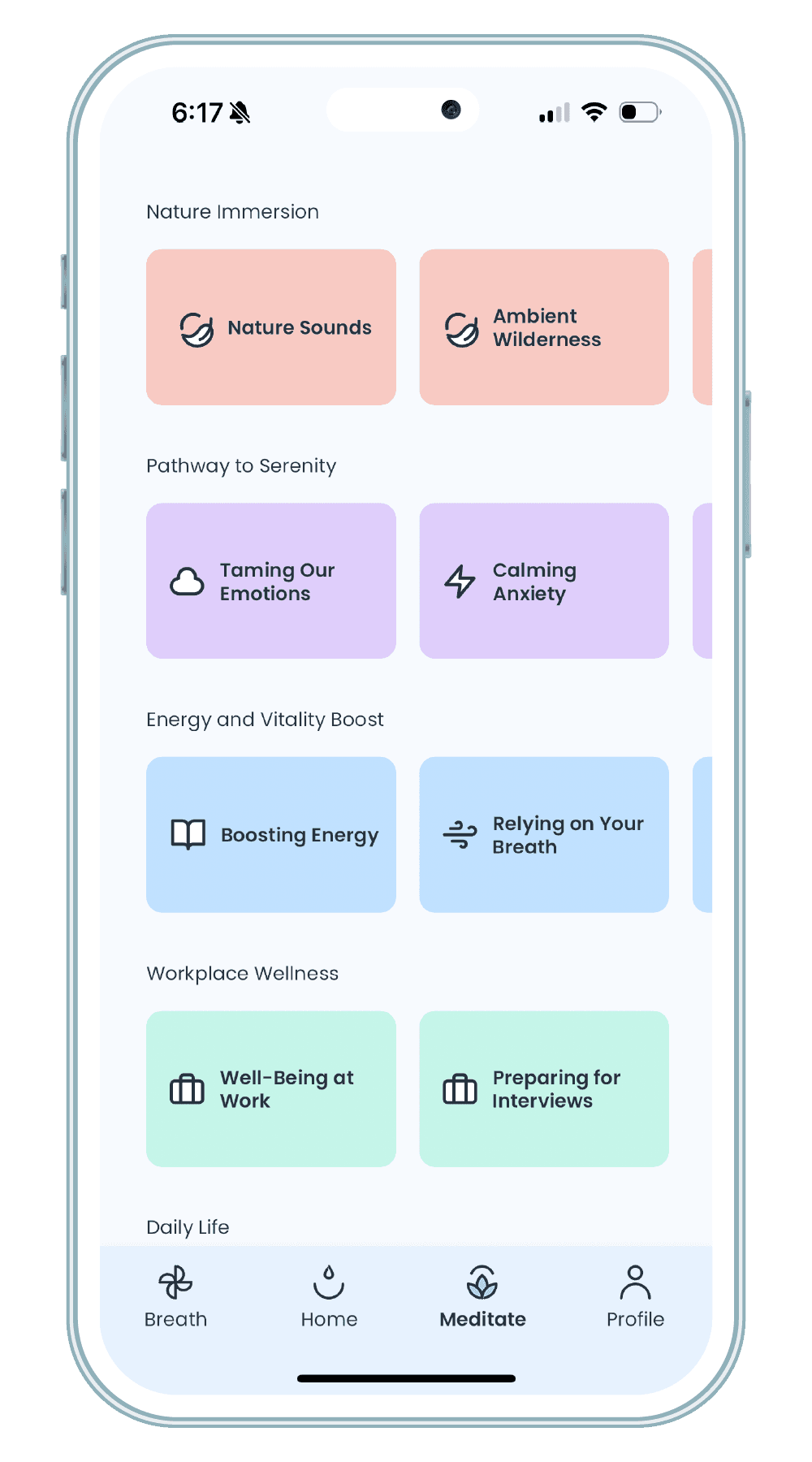
Color Coding
A meditation session is defined by a color, the session will keep it's color when the user adds it to his content aka Favorites or Downloads. This way, it is faster for them to find what they need.
Lessons
What I learned
Learning how to design systematically was part of my growing path in this project. First, because redesigning an app doesn't mean simply making the UI nicer, it's about rethinking the entire user experience. The priority was to refine the user journey and then to package it aesthetically. Second, reusing or improving components from the previous version that were already tested and used played a huge role.